Reports
Reports represent the history of one or more tags on a graph, allowing for a visual comparison between multiple tags with optional cross-project selection.
General View
Similarly to Tags or Pages, reports can be organized into folders on an hierarchical tree. When opened, this interface shows the top level of the hierarchy (the root location), with two tabs:
-
Lists the user-created reports and provides the report management tools as described below. -
Lists the reports shared with the user and is only visible at the root location. Report management tools are grouped into five elements: the header, the navigation pane, the bulk actions, and the list of entityFolder or report panes.
The navigation pane shows the breadcrumbs path to the current location, staring with Reports for the root position. Breadcrumbs can be clicked on to jump to a higher-level position.
Header toolbar provides the following tools:
-
Opens the folder creation dialog, which prompts for a name. Once created, opens the folder. -
Opens the Report Editor with a blank template.
The bulk actions pane has a checkbox followed by type-specific entity counts for the current location. The box selects/deselects all items on the list and, if checked, reveals the only available bulk action in this interface:
-
Deletes all selected items (confirmation required).
Only the selected items are counted unless none is selected.
The list consists of two sublists: folders above and reports below. Each entity is shown as a pane in its corresponding list. Entities in each sublist are sorted alphabetically in descending order.
Each entity pane has a checkbox that toggles selection for the specific item, followed by a folder/report icon to show the entity type, followed by the name of the entity.
Click on to reveal the following options:
-
Renames the entity. -
Deletes the entity (confirmation required). Deleting a folder results in deleting all the subfolders and/or reports it contains.
within a location, the same name can be used for two entities of different types but not for entities of the same type.
The following limitations apply to the subview:
- Header toolbar, selection, and bulk actions are not available.
- Only reports are listed since folders cannot be shared. All shared reports are located at the root.
- is present in the options but does not have effect. Shared reports can still be renamed with WRITE access, see Shared Reports for details.
Report Editor
Provides report configuration tools:
Metadata
-
Description of the report.
Group panes
A group is a selection of tags whose history is visualized on a single graph. A newly created report will contain an empty group with the default parameters.
In edit mode as well as under groups in view mode, each group is represented as a pane consisting of two sections: header and tag list.
The header has the following elements:
-
Label of the group under charts and tables. -
Allows dragging the pane to rearrange groups (only appears when hovering to the left of the name). -
Opens grouped list of projects the user has access to, with a filter field; multi-select allowed. - reveals the group context menu with the following options:
-
Opens the group configuration dialog for a new group. -
Opens the configuration dialog for the group. -
Creates a copy of the group without opening its configuration dialog. The copy will have a default name. -
Deletes the group (confirmation required).
-
The tag list is a two-column table:
A newly created group will read:
No projects selected
and have an empty tag list. Add one or more projects to the group; each added project will appear as a collapsible subgroup labeled with the project’s name and tag count.
button in the project’s subgroup creates a new row with a Tag Selector, which has two additional elements:
-
Valuefield contains a string that will be used as the tag's label, see table above. - removes the tag (no confirmation required).
Special considerations apply if the group is configured to generate a scatter chart:
- Each project is locked to have exactly two tags; two tag rows are created automatically upon adding a project, with no button.
- Each tag is axis-specific; the tag selector will only show tags whose engineering unit matches that of the axis. The configured engineering unit is displayed atop the tag row.
- Tag labels can be added but will not show on the scatter chart.
Read more about scatter chart configuration in the next subsection.
Group configuration
Configures an existing or newly added group:
-
Name of the group; default isDefault group. -
Description of the group under charts and tables; empty by default. -
Type of the graph generated for the group:-
Line chart(default) Bar chart-
Scatter chart, which locks the group to have two tags per project and unlocks two additional parameters: -
Engineering unit for X-axisandEngineering unit for Y-axisdetermine and place a limit on tag selection as described above. Default values areºCandkWh, respectively, allowing to plot power consumption as a function of temperature.
-
Switching between scatter and line/bar chart, or changing the engineering units under the scatter chart will clear tag selection, if any. A warning popup will appear before saving the configuration.
For details on graph types, see Chart Types.
Report Viewer
Click on a report in the General View to open it in view mode, with the following tools in the header:
-
See Report Subscription. -
See Shared Reports. -
Opens the report in the Report Editor. -
Deletes the report (confirmation required) and returns to its parent location (folder or root).
Shared Reports cannot be further shared or deleted, require WRITE access to be edited.
Tabs
The report viewer has the following tabs:
-
Shows group panes with projects, tags and their labels but no group-modifying tools. -
Displays a chart for each group in the report. Each chart is labeled with the configured name and (optionally) description of the group; group configuration also determines the chart type. -
Renders a table for each group in the report, where:- Each row is timestamped and corresponds to a data point or a data group.
- Each column represents a tag and is labeled with the tag’s name, followed by the name of its project; chart labels do not apply.
No historymessage signifies missing data.
Timespan
Time selector is available for charts and tables; it determines the timespan for each group. Timespan is defined as the period between two points: From and To. Click on either field to open a datetime picker and specify the exact date and time.
Alternatively, timespan shortcuts 1H, 1D, 1W, 1M, and 1Y can be used to set the timespan to one hour, 24 hours, 7 days, one month, or one calendar year preceding the current time, respectively. Shortcut ALL sets the timespan to be between the datetime of the earliest recorded value of any tag in any of the groups, and the current time.
Although only one timespan is set for the entire report, it will be trimmed individually for each group according to its range of available values.
Data Grouping
Data is grouped automatically depending on the timespan duration:
- Less than 7 days: by hours
- 7-30 days: by days
- More than 30 days: by weeks
Grouping reduces sample size by averaging all values sampled during a single hour/day/week. Time selector shows the grouping unit if the timespan was set with a shortcut.
Chart Types
The following types are available:
Line chart
Default graph type; renders a uniquely colored curve for each tag by plotting its values on the Y-axis against time on the X-axis. Toggles atop the chart add/remove curves. Each toggle is labeled with its tag’s label (if specified) or as Tag name [Project name].
The graph generator auto-detects the engineering units in the group’s tags and labels the Y-axis with the them. opens the table of options for each unique engineering unit on the chart:
-
,
Set the limits for the Y-axis. Values outside these limits are not plotted. No limits by default/unless specified. -
Sets the scale division value for the Y-axis. By default/unless specified, step is set to the largest $10^n$ value below the maximum of the graph. -
Determines whether the Y-axis labels are shown left (L, default) or right (R) of the graph.
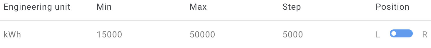 The kilowatt-hour curve on this graph is set to be trimmed at 15000 and 50000, with the Y-axis labeled to the left of the graph, its scale divided into segments of 5000. The resulting curve looks as follows:
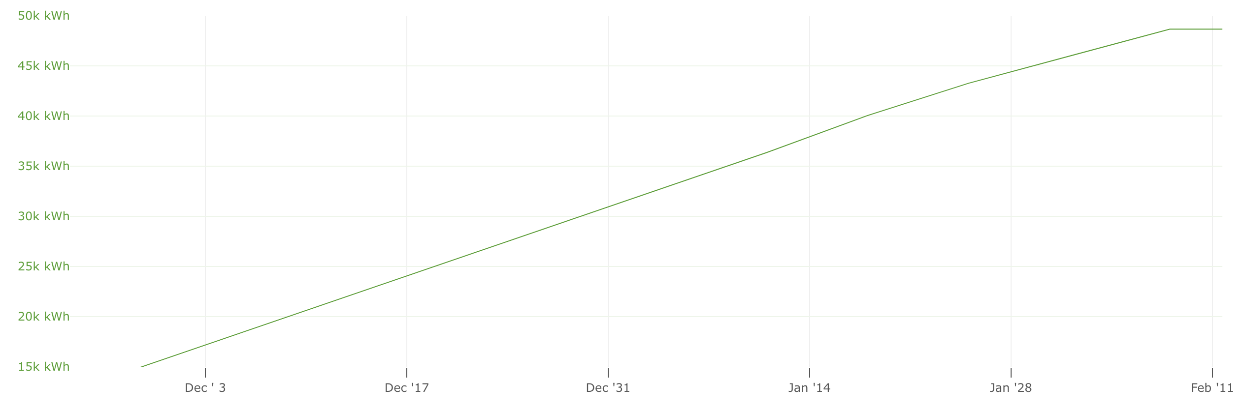
When there are different engineering units, each has its own scale ranging from the minimum to the maximum value (observed or set as a limit). Y-axis labels are color-matched to the curves in order to help differentiate the scales visually.
If a graph has more than two unique engineering units, the settings dialog shows a checkbox for each. Unchecked units move to the Other category, which also includes all tags without an engineering unit. All other units are plotted against the same scale on the Y-axis without unit labeling.
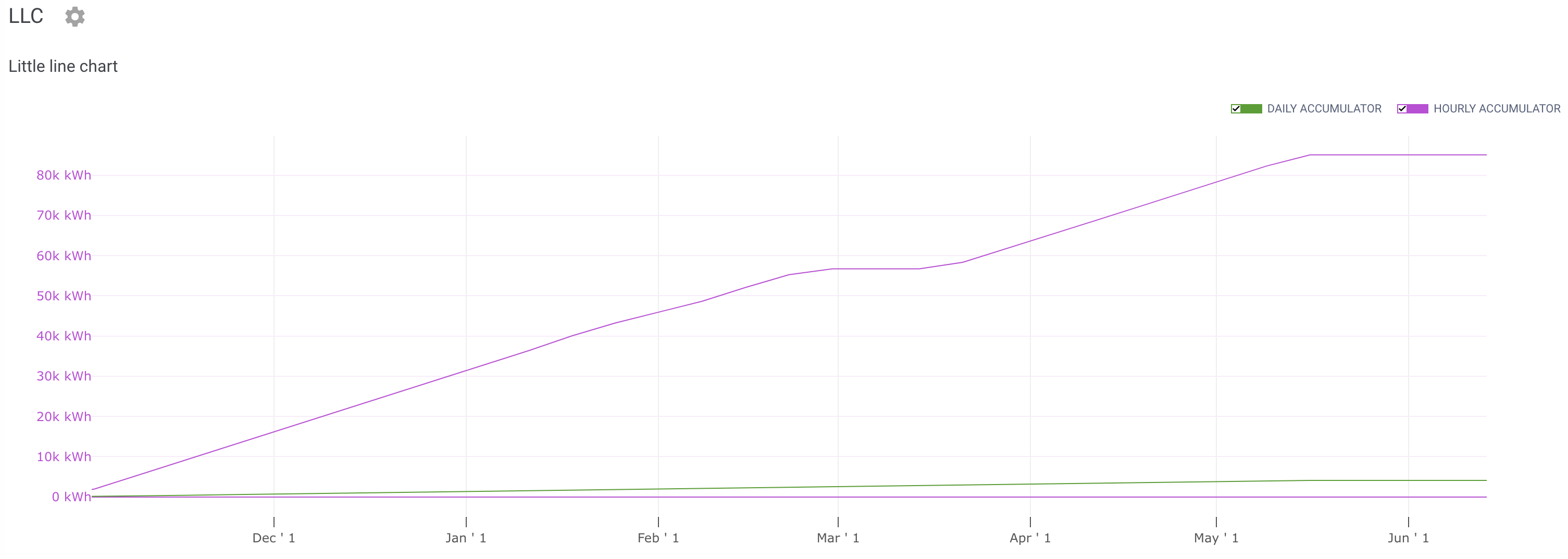
Fig. 1. Line chart shows total accumulation over the timespan.
Note that data is not grouped on the line chart.
Bar chart
Renders a vertical bar for each time point as determined by value grouping. Toggles atop the chart add/remove curves. Each toggle is labeled with its tag’s label (if specified) or as Tag name [Project name].
The bar chart is stacked, i.e., each bar is split into uniquely colored segments, one per tag in the group. Segment heights are scaled against the Y-axis for value visualization. If data is grouped, bars represent grouped values rather than raw data.
In contrast to line charts, engineering units are not auto-detected, the Y-axis has only one scale with no unit labels, and no further chart customization is possible.
Accumulator and Counter tags have unique behavior with bar charts: instead of showing the total accumulated value, each bar shows the value accumulated during the period that the bar represents; cf. Fig. 1 and Fig. 2.
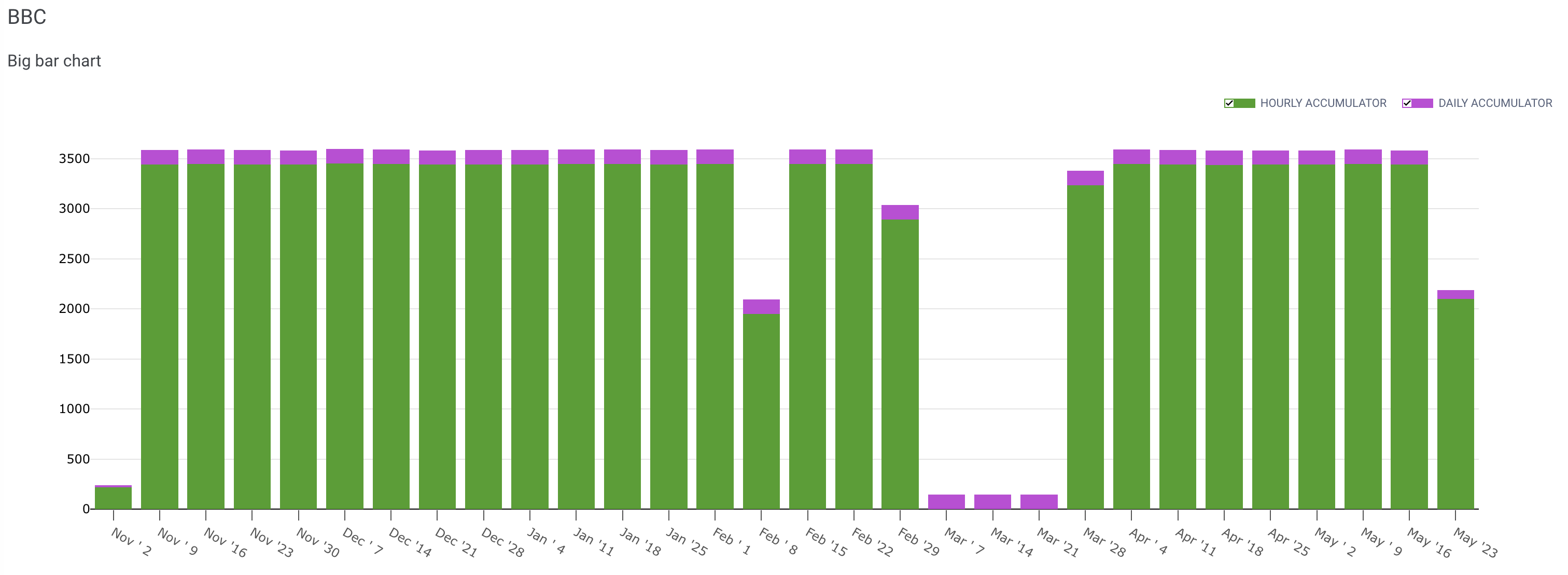
Fig. 2. Bar chart shows accumulation for each week in the timespan.
Scatter chart
Plots the data a series of dots on a 2D plane. Each axis represents a tag, and the coordinates of each dot correspond to the concurrent values of the tags.
Scatter chart helps visualize potential binary correlations, e.g., temperature vs valve opening. Unlike line or bar charts, scatter plotting does not produce a timeline; nevertheless, data sampling is confined to the specified timespan. If data is grouped, dot coordinates match grouped values rather than raw data.
Engineering units are predefined and hard-linked to the axes, one for each, in the group’s settings. opens the table of options for these engineering units:
-
Set the limits for each respective axis. Values outside these limits are not plotted. No limits by default/unless specified. -
Sets the scale division for each respective axis. By default/unless specified, step is auto-calculated to fit the observed number of points within the scale range.
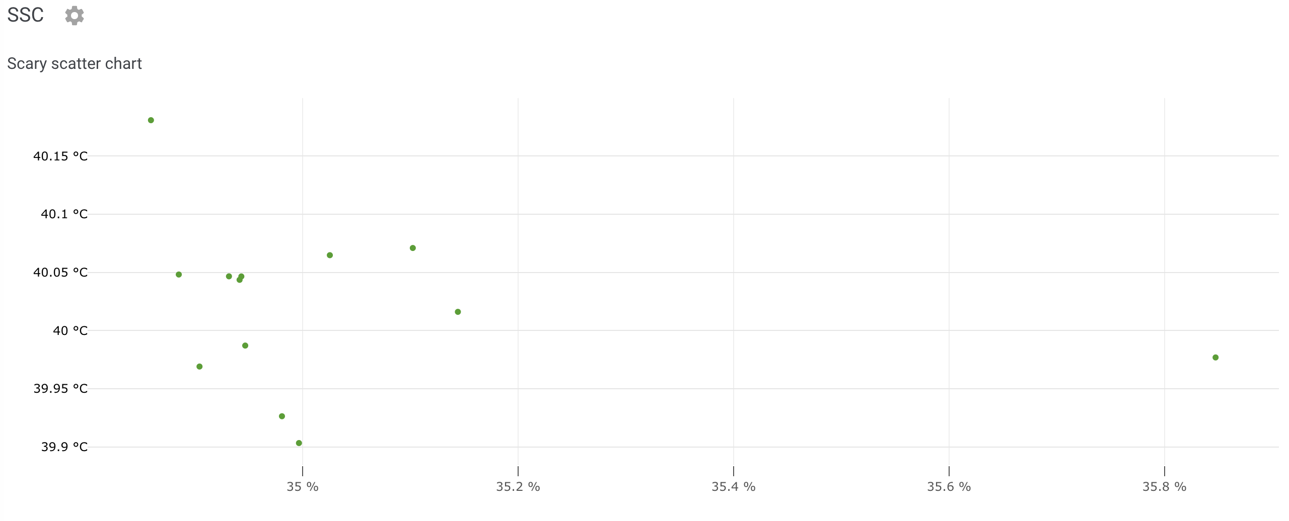
Fig. 3. Scatter chart shows potential correlation between two values.
Tip
Hover over any graph to reveal a tooltip with additional details: tag names and exact values, timestamps (line/scatter charts), and source project (scatter charts only).
Report Subscription
Subscription shortcut () can be found in the Report Viewer. For subscription management, see Subscriptions.Subscribe to receive an updated version of the report regularly on the email. The subscription dialog has the following options:
-
Name of the newly created subscription, under which it will be listed in managed subscriptions. Subscription name is also used in the email subject. -
Reporting frequency, with the following options:-
Daily— Every day of the week that is checked in the bar below; all days are checked by default. -
Weekly— Every week on the day that is checked in the bar below; Monday by default. -
Monthly— Every month on the day selected in the dropdown below; or last day of the month if the selected day is outside the month’s duration. -
Yearly— Every year on the date selected in the dropdowns below (day and month).
-
If the selected day (or DD/MM) is ahead of subscription date, the first report will be sent the same month (year). Otherwise, the first report will be sent the next month (year).
Hours and Minutes specify the report generation time. The report will provide data spanning the duration of its interval up to the report generation time.
Reports are attached as .pdf or .csv files.
Shared Reports
Sharing shortcut () can be found in the Report Viewer; see also Shared Reports Links.
A report can be shared in two ways:
-
Suitable for sharing reports with other Cloud users. Enter the email associated with the recipient's Cloud account. The invited users are listed below with a Filter field for convenience.For each invited user, can be set to:
- READ — Read access only
- WRITE — Write access (allows to modify or rename the report, but not delete it)
-
Creates a link that can be shared with anyone on the Internet, with two options:-
If unchecked (default), project names are omitted from the version of the report accessible by the link. -
Sets the link expiration date:1 day(default) to1 yearfrom the link creation time. ChooseForeverto make a non-expiring link.
Report shared via a link can be accessed by anyone with the link. For this reason, such links are limited to read-only access.
-