Trends
Trends are a tool that visualizes tag data by plotting it on a graph as a function of time. The tool is designed to facilitate visual comparison and help identify patterns in tag behavior.
Trends are viewed and managed from the same interface; unlike Pages or Alarms, trends can only be accessed via the HMI.
Trend Management
Trends are managed exclusively within, and as part of, trend groups. Trend groups are listed in the Navigation.
Each trend group is represented as a folder with trends. Folder icon indicates the group’s class:
- for personal groups, which are only visible to whoever created the group.
- for global groups, which are visible to all users in the project with any level of HMI access.
Click on a group to select it. Selecting a group expands it to reveal the trends within. By default, the first group is selected and expanded. Trends within a group can be sub-selected to control the scope of data displayed in the Viewer. Only one trend group or one trend can be selected at a time.
The following group management tools are available:
-
Opens the group editor with an empty preset, see below. -
Opens the selected group in the editor. -
Deletes the selected trend group; confirmation required.
and are only visible when a group is selected.
Group editor
Trend group editor is a step-by-step dialog:
Choose Data Channels
-
Name of the trend group. -
Tag Selector; click on or to toggle page/tree selection mode. Select one or more tags and click on to add them to the trend group. -
Lists the tags to be added to the trend group. Use or to remove tags from the list. - operatorRequires HMI operator privileges under the project; contact EnergyMachines support for details.
If checked, the group will only be visible to the user who created it. Uncheck to make the group global.A global trend group cannot be reverted to being personal.
Viewer
Trends can be viewed in real time as the data is polled or from the stored history. Depending on your needs, the data can be viewed as a Graph, Scatter or Table. Animated screenshot below shows how to create a trend group and modify and how to add a data point.
Fig. 1. Trend Groups
Newly created trend groups are personal, indicated as . Here’s how to make it global (i.e., accessible by all users), which will also change the icon to :
Fig. 2. Trend globalization
Globalization requires operator-level access to HMI.
Pick a period of data to display from the presets on top. For example, clicking on will return data spanning one week preceding the current time. Alternatively, an exact timespan can be specified by using the datetime picker.

Fig. 3. Select Trend Period
History viewer
History viewer has several instruments to adjust the display of a trend group.
You can switch from the graph view to the table view using respective buttons , , in the trend viewer’s header. These buttons represent three views that a trend group can have:
- Graph View
- Scatter Chart View
- Table View
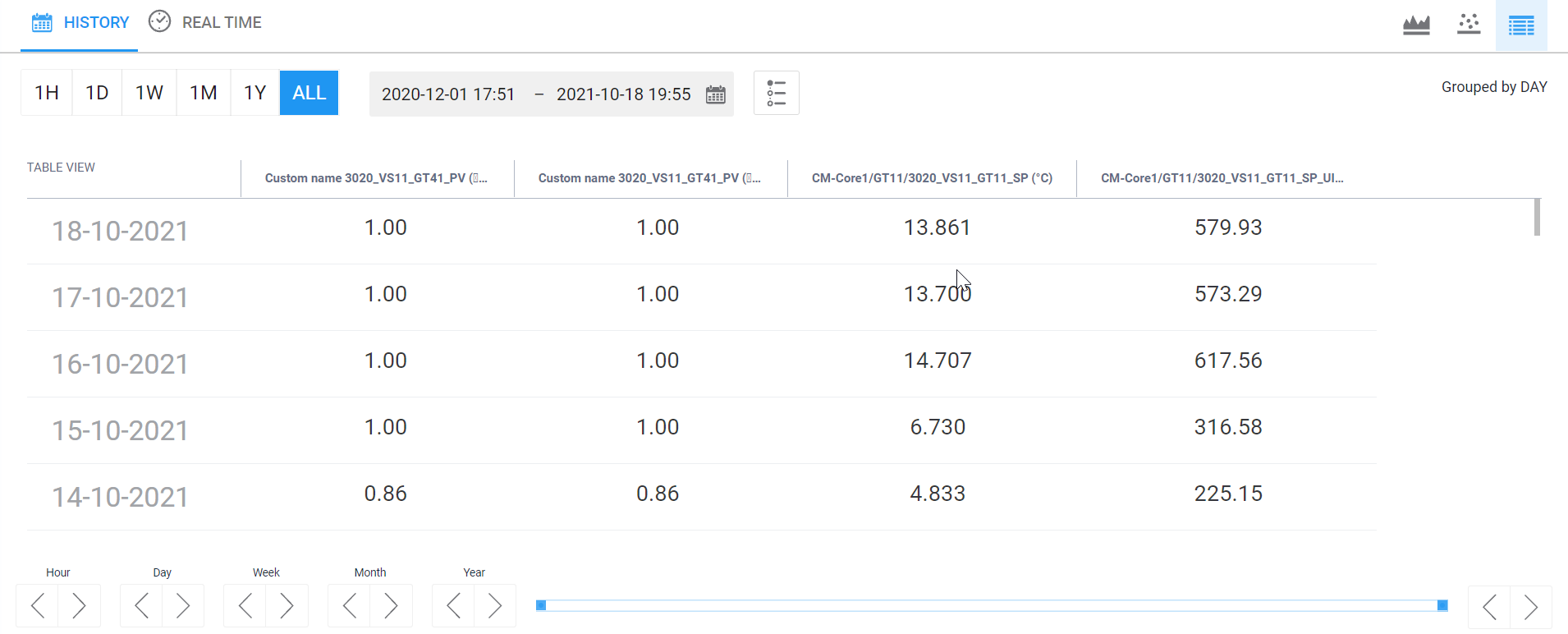
Fig. 4. Table view
Time controls menu
Adjusts historical data periods. It is possible to display tag values for an hour, a day, a week, a month, a year or the whole period of tag’s functioning. A custom period of data to display can be set. See the menu in the following figure.

Fig. 5. Time controls menu
Compare tag values for the same period from another year. Click on and select comparable tags. Comparison can be rendered as a graph or as a table. The data from a different year is shown as a separate graph or column depending on the view.
HMI View displays the user time zone by default. You can configure the time zone parameter in your Personal Cloud Profile. If you have not specified user time zone, HMI View shows time according to the project preferences. When neither of these parameters is set, the browser time zone is used.
Customizing the data display
A toolbar on top of the history viewer contains instruments for customizing the data display.
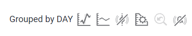
Fig. 6. History viewer toolbar.
, Interpolation
Toggles data interpolation.
Show Min/Max
Toggles Min-Max mode to display the lowest or the highest of values by shading areas around the aggregated value line, see example below.
Fig. 7. Min/Max mode with displayed events.
This mode is available when tag values are grouped by a period. In this case, the graph shows aggregated data and the painted area shows the range of values that took place.
Manage Axes
Opens a menu for adjusting axes. You can configure Min and Max for an axis, its step and the side of the display: left or right. The axis configuration applies to both and .
, Show/Hide Events
Show events that occurred with tags from the trend group. You can see the following events:
- Alarm activation
- Alarm deactivation
- Tag value update
History navigation menu helps to move on the time axis in the graph view. You can quickly select and zoom to a time period by clicking and dragging horizontally within the chart area.

Fig. 8. History navigation menu.
Certain trends may contain multiple tags, cluttering the >. You can hide of show the trend by clicking its label in the legend above.
Fig. 9. Hiding and showing trends in Graph View.
Sharing trends
Click on in the toolbar and set the period during which the link would be active, then . This action will return a ready-to-share link.
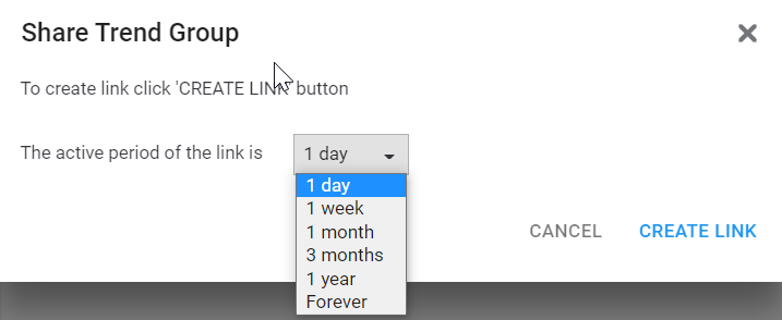
Fig. 10. Share Trend Group menu
You can manage links to trend groups in your Personal Cloud Profile.