Analyze Trends
This is an introductory guide; for a complete manual on this interface, see HMI » Trends.
When managing a project, you might want to see how tag values relate to each other. After all, data visualization is a powerful tool that allows to find out causation and correlation that might not be obvious at first. HMI has your back with an extensive built-in graphing toolkit.
Once again, we’ll be using our Demo Setup to demonstrate how you can dig deeper into the behavior of your tags over time. We’ll be using the following terminology:
- Trend
- Graph of a single tag’s values over time.
- Trend group
- Graph with multiple trends superimposed on a single 2D plane.
Note that you cannot view a single trend without creating a trend group with it — so let’s start with making one.
Create a Trend Group
There are two methods you can use to make one. One method is already covered in Make a Trend; it’s quick, and you don’t even have to open the interface. However, it also limits your selection of tags to those attached to a page. What if you want to plot graphs of tags from different pages? This is where another method comes into play:
- Where
- » Navigation »
That’s how you open the dialog we’re now going to walk through, step by step:
- Come up with a name for your trend group and enter it under . The name must be unique among the trend groups on the list.
- Select tags under . What is a data channel? It's a point that provides you with a stream of data. So, it's another word for tag.
- You'll see the list of all tags configured for your project, organized in expandable folders. You can select tags one by one.
- If there are too many folders and tags to choose from, don't hesitate to use the searchbar atop the list.
- An alternative tag selection method is available, see Tag Selector.
- Once you've decided which tags you want to plot graphs for, simply click on :
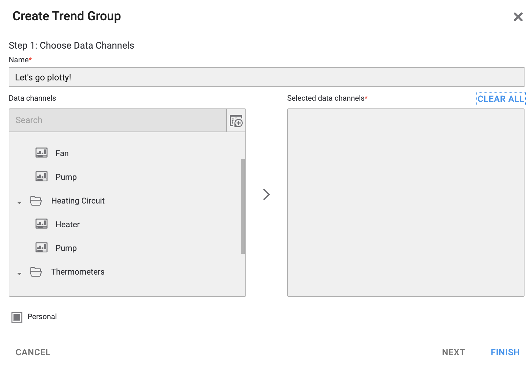
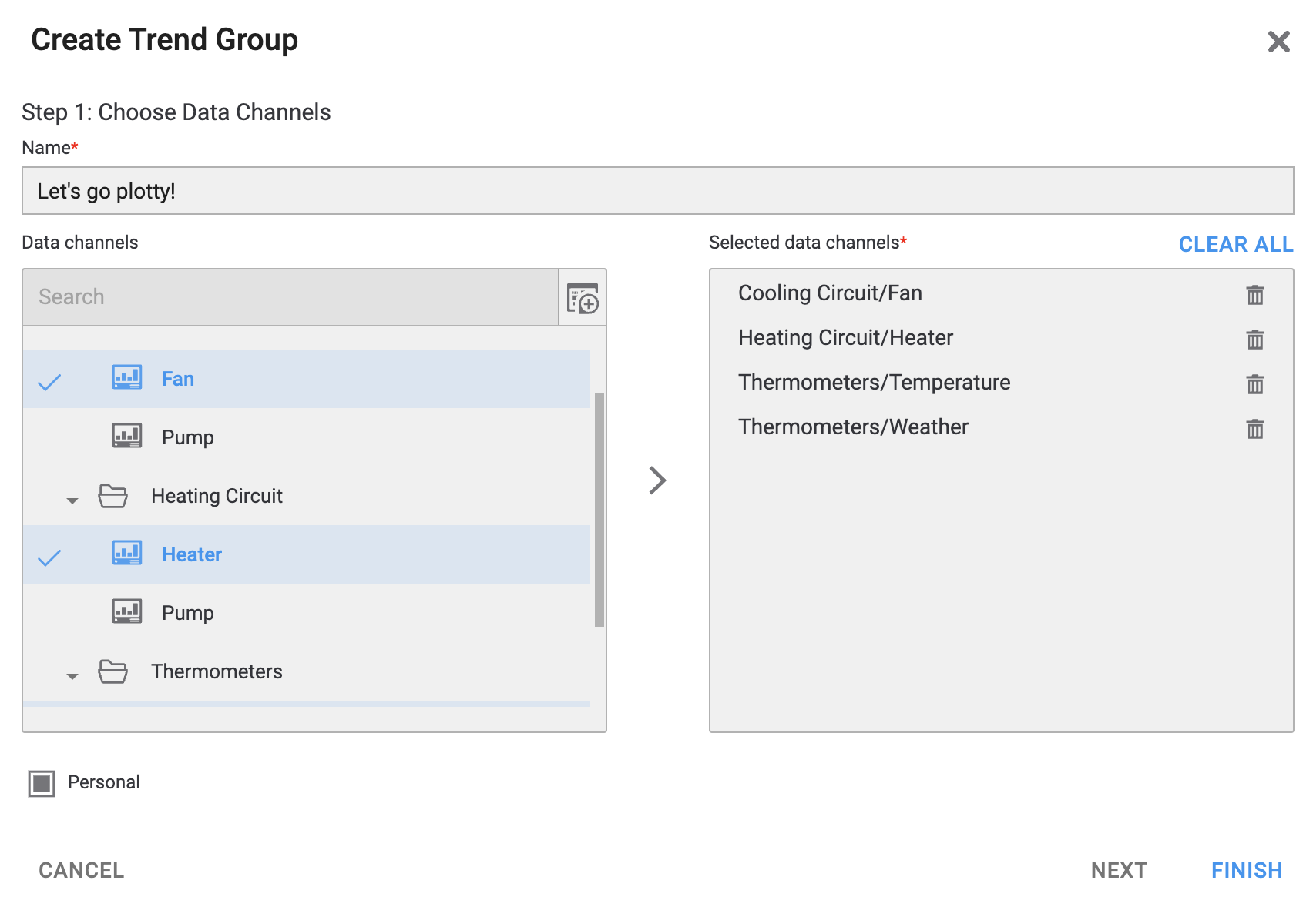
Fig. 1. We've made a selection, yay!
You can click on a selected tag (to the left) or use the button (to the right) to remove tags from your selection one by one. You can also use to remove them all at once and start anew. - Decide if you want to keep your trend group . If you do, simply proceed to the next step. If you don't, uncheck this box to make the group public. Note that you can make a personal group public later, but not the other way round.
- Now simply click on and enjoy the view!
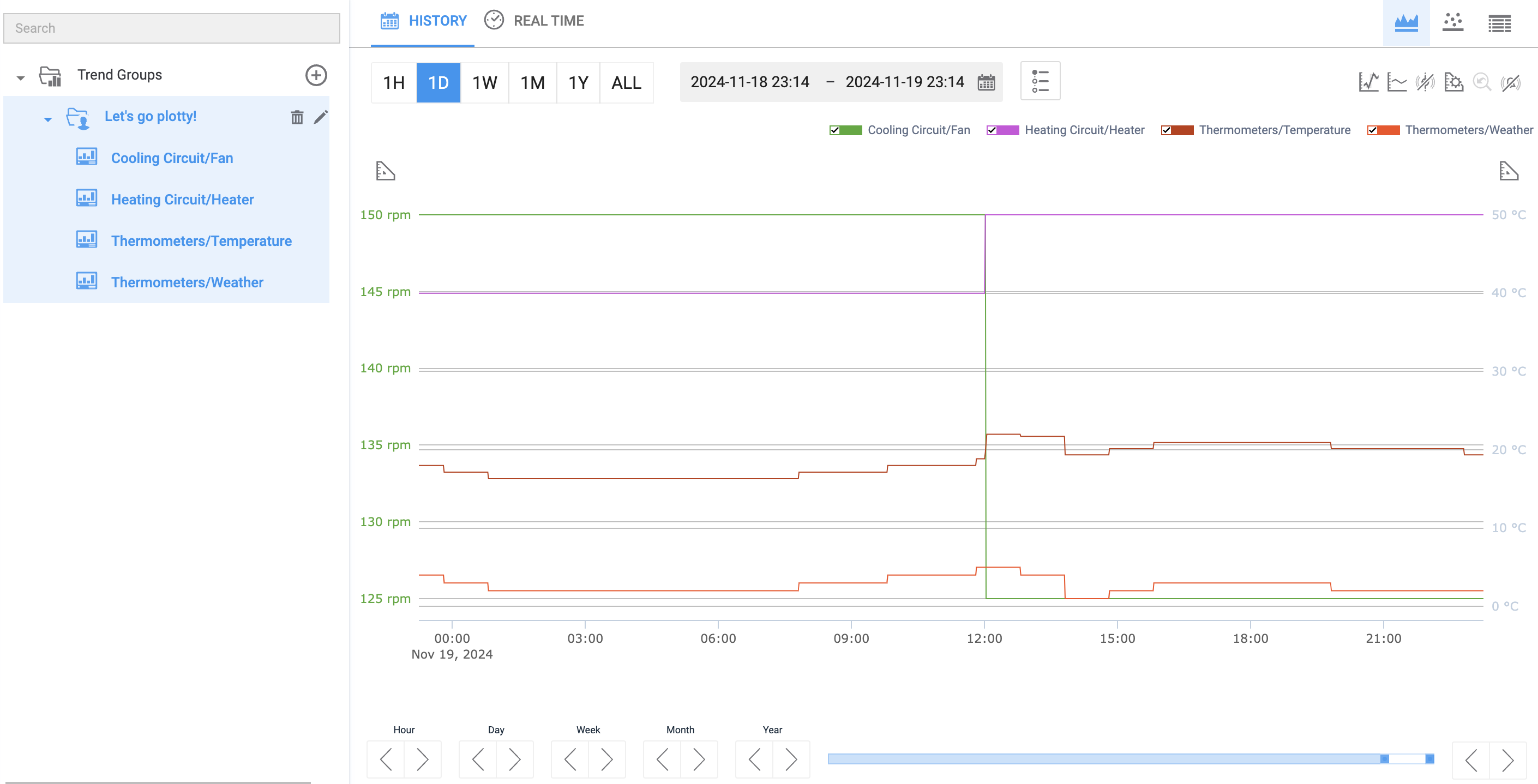
Fig. 2. Now, that's a trend group!
Your trend group will now be listed in the navigation, where you can or it. You can select any group on this list to open it in the trend viewer; or, by expanding the group, you can pick a single tag from it and see it as a trend.The trend viewer in the HMI comes with two tabs:
-
Plots the selected trends over a user-configurable period of time. -
Plots the selected trends live, only showing the current value(s) and updating once every 15 seconds.
Trend groups sample data from tag history, which therefore must be enabled for all tags whose values you want to plot.
Let’s dig into some history, shall we?
See History
The most common use case of trend groups is seeing how tag values changed over time, so let’s see what we can do there.
- Where
- »
This history view consists of several elements:
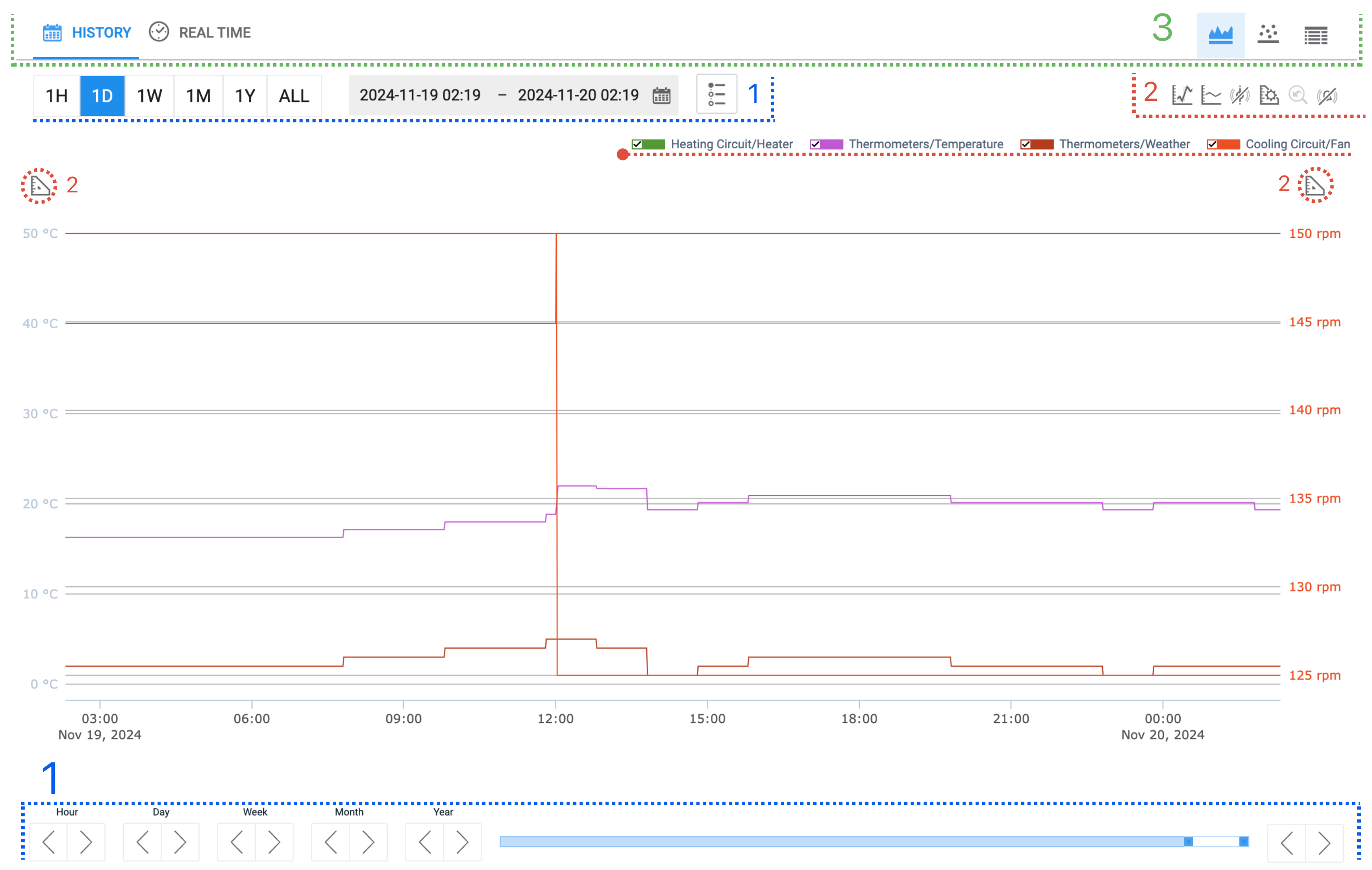
Fig. 3. Trend graph and its controls.
What are those elements?
-
These help you adjust which time period to plot tag values over. -
These allow you to fine-tune what your graph should look like. -
These determine which type of graph is rendered.
As you can see, there is quite a set of available customizations. You may want to use those as the initially produced graph might not be particularly informative or visually appealing. So, let’s dissect what could be done to further improve it.
Set a Period
You have four options here, two of which are located above the graph:

- Use one of the shortcuts to the left to choose a preset period spanning from one hour (
1H) to one year (1Y) prior to the very moment you’re looking at the graph. Or simplyALLif you want to see the entire available history. If you use a shortcut, it will be highlighted unless to modify the selection otherwise. - Use the datetime picker to the right to set a period more precisely, down to a minute.
Two more options can be found at the bottom: 
- Use the and buttons to switch the displayed timeline by one
Hour,Day,Week,Month, orYear. - Move the position marker along the timeline bar to select a time period. Drag th ends of the marker to adjust the duration of the period.
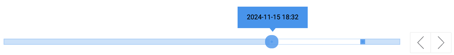
For this guide, it will suffice to set the period to one day prior with the corresponding shortcut at the top.
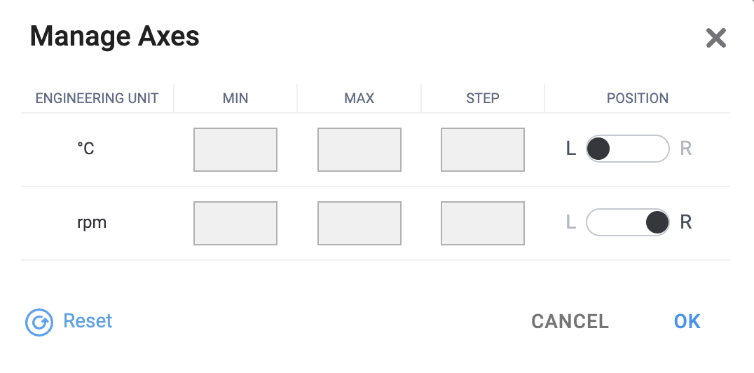
Trim and Scope
In the graph, each tag is represented by a curve whose color is assigned automatically by default. Atop the graph, you can see a correspondingly color-coded switch for each tag. You can flip any switch to remove the tag’s curve from the graph if you want to declutter the view; for now, we’ll keep all of them visible.

The graph plots the values of tags on the Y-axis and the time on the X-axis. The Y-axis has scales on both sides of the graph, labeled with, and graded for, the different engineering units configured for the plotted tags. In our case, those are ºC and rpm.
In our example, the Cooling Circuit/Fan only has two values in the selected time period: 125 rpm and 150 rpm. By default, the Y-axis is trimmed to fit the exact range of the given values, but this might be suboptimal or visually hindering. Luckily, we can configure the Y-axis to solve this problem.
- Where
- » »
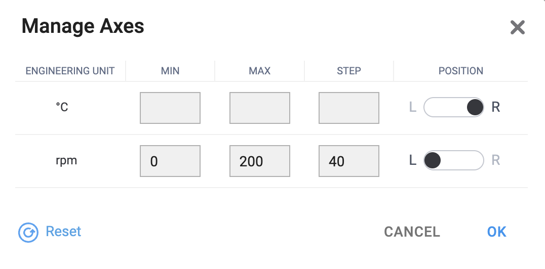
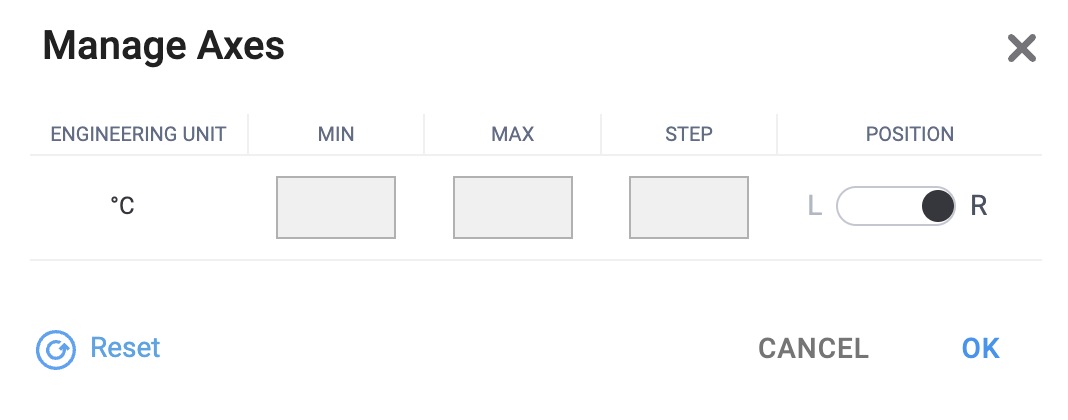
This tool lists the engineering units that the Y-axis is scaled in. Let’s say we want the displayed range for rpm to be between 0 and 200. To that end:
- Enter
0under - Enter
200under
You can further control the resolution of this value on the Y-axis by specifying the as, say, 40. This will change how the graph is lined: each line, bottom-to-top, will now correspond to an increment of 40 from 0 all the way to 200.
Finally, it’s also possible to flip the positions of the axes and show degrees Celsius on the right and the revolutions per minute on the left. This will not make a lot of difference in a simple graph where you only have two units, and their values are on the same order of magnitude; but they could really come in handy if you want a cleaner rendering of a more complicated graph.
|
|
Fig. 4. You can always the axes to their default configuration.
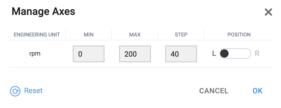
An alternative tool, , can be found to the left and to the right above the graph. It largely offers the same settings, but only shows the engineering units already positioned on each corresponding side.
|
|
Fig. 5. Axes can be configured individually, too.
Add More Data
The graph already provides quite a useful insight, but here’s one more great trick up the HMI’s sleeve:
- Where
- » »
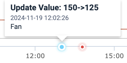
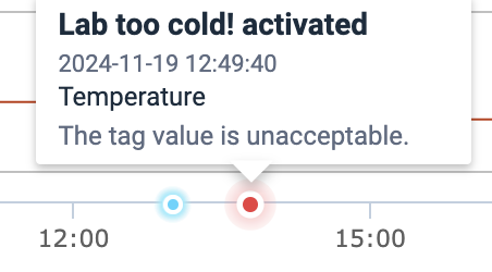
When triggered, it will add peculiar dots on the X-axis. Hover with the mouse over these dots to see some peculiar things that happened to the plotted tags:
- Activations of alarms, with timestamps and metadata
- User activity, namely tag value updates, with timestamps, tag names, and value changes.
|
|
Fig. 6. Precisely timestamped events, right on the graph!
If you don’t want to see the events anymore, simply toggle them off by clicking on , which you can find at the same location.
See Results
Once the customizations are done, it is time to finally look at the graph and analyze.
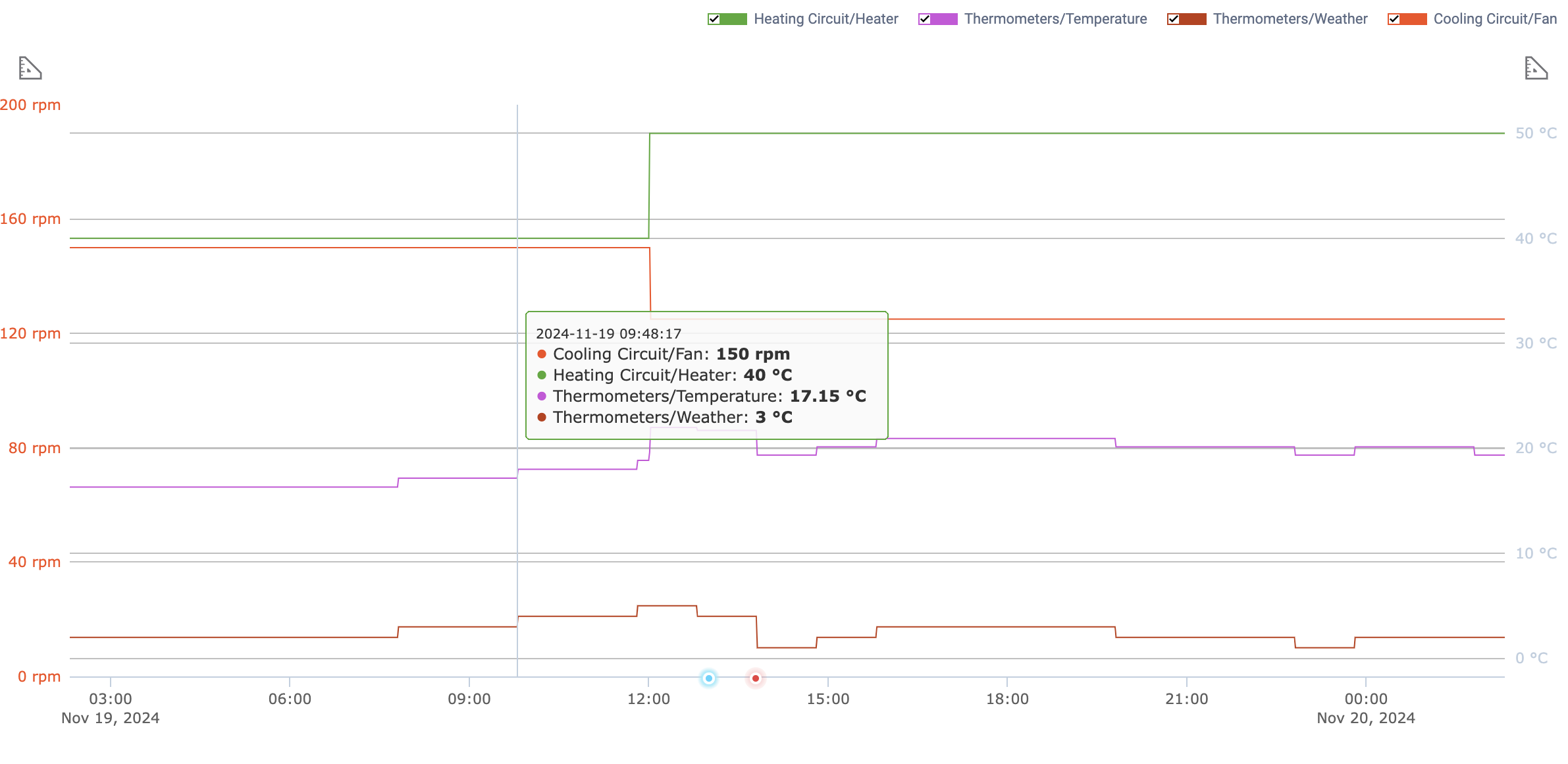
Fig. 7. Graph after customization.
Yes, you can also hover anywhere over the graph to see the exact data for each graph at an exact point in time, as shown in the screenshot above. Furthermore, you can also change the type of the graph itself:
- Where
- » »
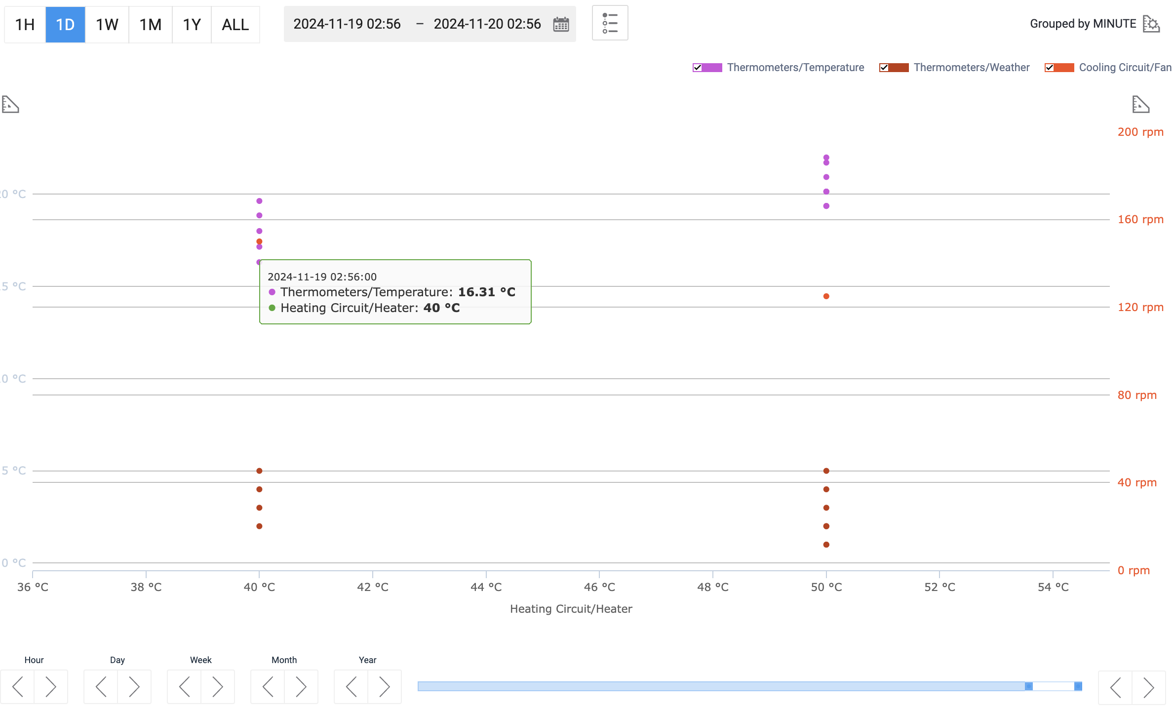
Fig. 8. Same data, now on a scatter plot.
Y-axis can be configured in the same manner as shown in Trim and Scope. Scatter points can be hovered over to reveal more details as shown in the screenshot above.
If you’d rather have a dataset where each tag’s precise values are time-matched to those of other tags, you can use the final view option:
- Where
- » »
This view is simply a table that shows the values of the selected tags over the selected time period in reverse chronological order. Each row corresponds to a grouping unit, which is determined automatically based on the length of the selected period. No further customization is possible here.
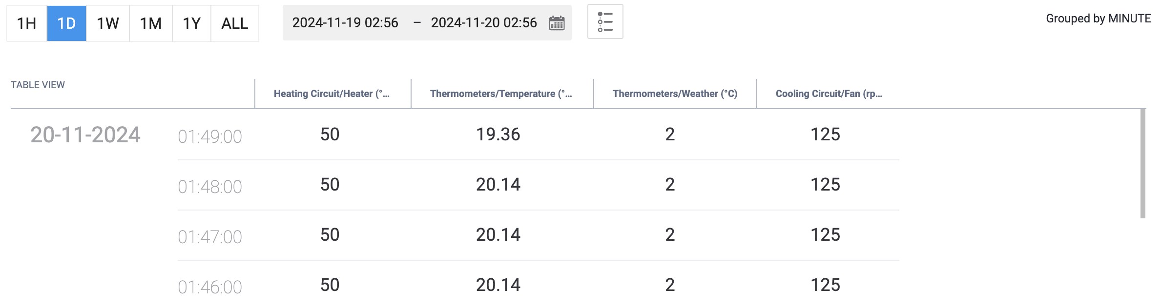
Fig. 9. Table view could be of use for data mining.
MANY MORE TOOLS...
... are available for trend groups. You can customize the appearance of the curves, see values as they get updated in , and apply more advanced data filtering, to name a few. This simple guide only reveals the tip of this iceberg — see how deep it goes in our more advanced manual: Trends.