Trends
Trends are a tool that visualizes tag data by plotting it on a graph as a function of time. The tool is designed to facilitate visual comparison and help identify patterns in tag behavior.
Trends are viewed and managed from the same interface; unlike Pages or Alarms, trends can only be accessed via the HMI.
Trend Groups
Trends are managed exclusively within, and as part of, trend groups: user-defined sets of tags that determine the scope of data shown as trends. Trend groups are listed in the Navigation.
Each trend group is represented as a folder with trends. Folder icon indicates the group’s class:
- for personal groups, which are only visible to whoever created the group.
- for global groups, which are visible to all users in the project with any level of HMI access.
Click on a group to select it. Selecting a group expands it to reveal the trends within. By default, the first group is selected and expanded. Trends within a group can be sub-selected to control the scope of data displayed in the Viewer. Only one trend group or one trend can be selected at a time.
The following group management tools are available:
-
Opens the editor with an empty preset, see below. -
Opens the selected group in the editor. -
Deletes the selected trend group; confirmation required.
and are only visible when a group is selected.
Editor
Multistep dialog wherewith users can create and/or edit trend groups, the editor contains the following subinterfaces:
Choose Data Channels
-
Name of the trend group. -
Tag Selector; click on or to toggle page/tree selection mode. Select one or more tags and click on to add them to the trend group. -
Lists the tags to be added to the trend group. Use or to remove tags from the list. - operatorRequires HMI operator privileges under the project; contact EnergyMachines support for details.
If checked, the group will only be visible to the user who created it. Uncheck to make the group global.A global trend group cannot be reverted to being personal.
Viewer
2D plane where the selected data is plotted or otherwise visualized.
Tabs
The viewer has its own header with two tab groups:
— Switches between data sources:
- Samples data stored in the History of the selected tags.
- Renders curves based on realtime data feed from the selected tags.
— Switches between data rendering modes ( only):
- plots data as continuous curves on a biaxial plane.
- plots data scatter, visualizing its distribution rather than raw values.
- shows (optionally) aggregated data in a tabular format.
See View Modes below for more details.
To sum it up…
…the editor configures what to plot; the viewer configures how to plot.
View Modes
Trends can be visualized in three different modes:
Line chart
Default graph type; renders a uniquely colored curve for each tag by plotting its values on the Y-axis against time on the X-axis. Toggles atop the chart add/remove curves. Each toggle is labeled with its tag’s label (if specified) or as Tag name [Project name].
The graph generator auto-detects the engineering units in the group’s tags and labels the Y-axis with the them. opens the table of options for each unique engineering unit on the chart:
-
,
Set the limits for the Y-axis. Values outside these limits are not plotted. No limits by default/unless specified. -
Sets the scale division value for the Y-axis. By default/unless specified, step is set to the largest $10^n$ value below the maximum of the graph. -
Determines whether the Y-axis labels are shown left (L, default) or right (R) of the graph.
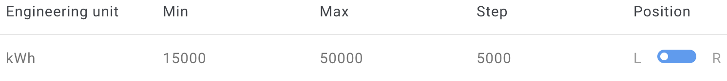 The kilowatt-hour curve on this graph is set to be trimmed at 15000 and 50000, with the Y-axis labeled to the left of the graph, its scale divided into segments of 5000. The resulting curve looks as follows:
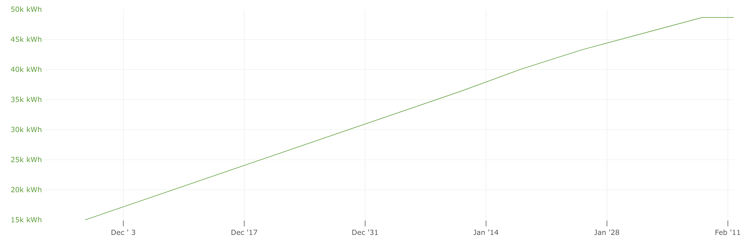
When there are different engineering units, each has its own scale ranging from the minimum to the maximum value (observed or set as a limit). Y-axis labels are color-matched to the curves in order to help differentiate the scales visually.
If a graph has more than two unique engineering units, the settings dialog shows a checkbox for each. Unchecked units move to the Other category, which also includes all tags without an engineering unit. All other units are plotted against the same scale on the Y-axis without unit labeling.
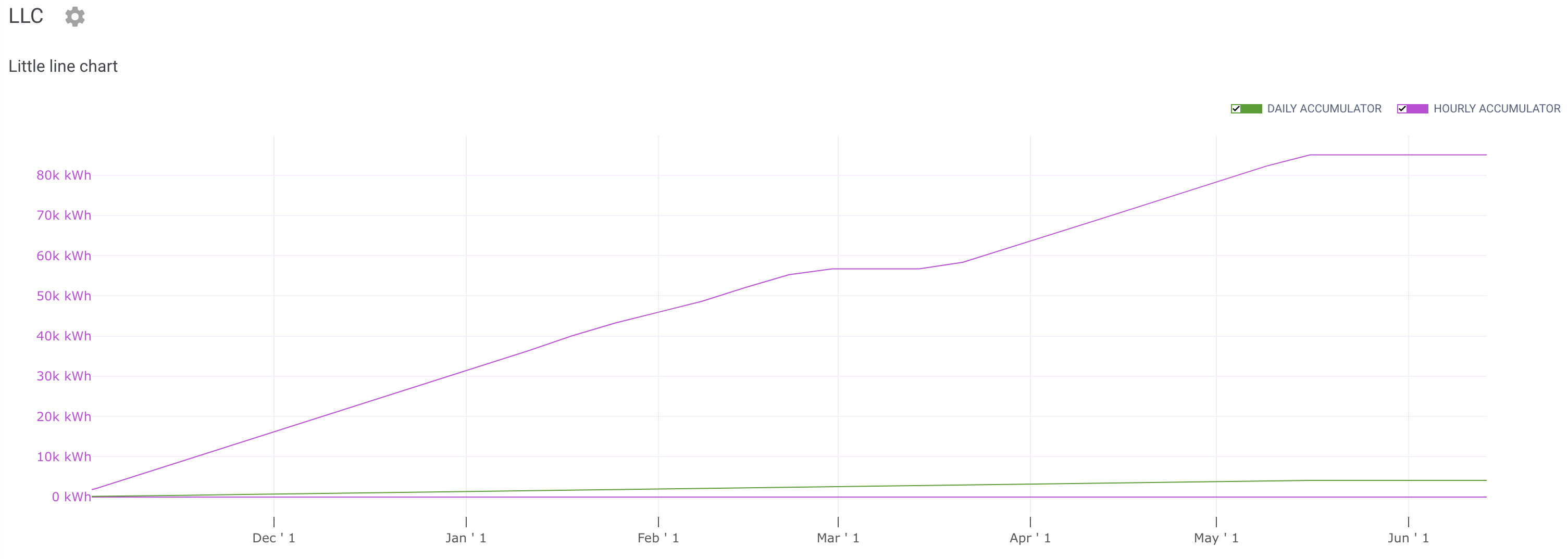
Fig. 1. Line chart shows total accumulation over the timespan.
Note that data is not grouped on the line chart.
Bar chart
Renders a vertical bar for each time point as determined by value grouping. Toggles atop the chart add/remove curves. Each toggle is labeled with its tag’s label (if specified) or as Tag name [Project name].
The bar chart is stacked, i.e., each bar is split into uniquely colored segments, one per tag in the group. Segment heights are scaled against the Y-axis for value visualization. If data is grouped, bars represent grouped values rather than raw data.
In contrast to line charts, engineering units are not auto-detected, the Y-axis has only one scale with no unit labels, and no further chart customization is possible.
Accumulator and Counter tags have unique behavior with bar charts: instead of showing the total accumulated value, each bar shows the value accumulated during the period that the bar represents; cf. Fig. 1 and Fig. 2.
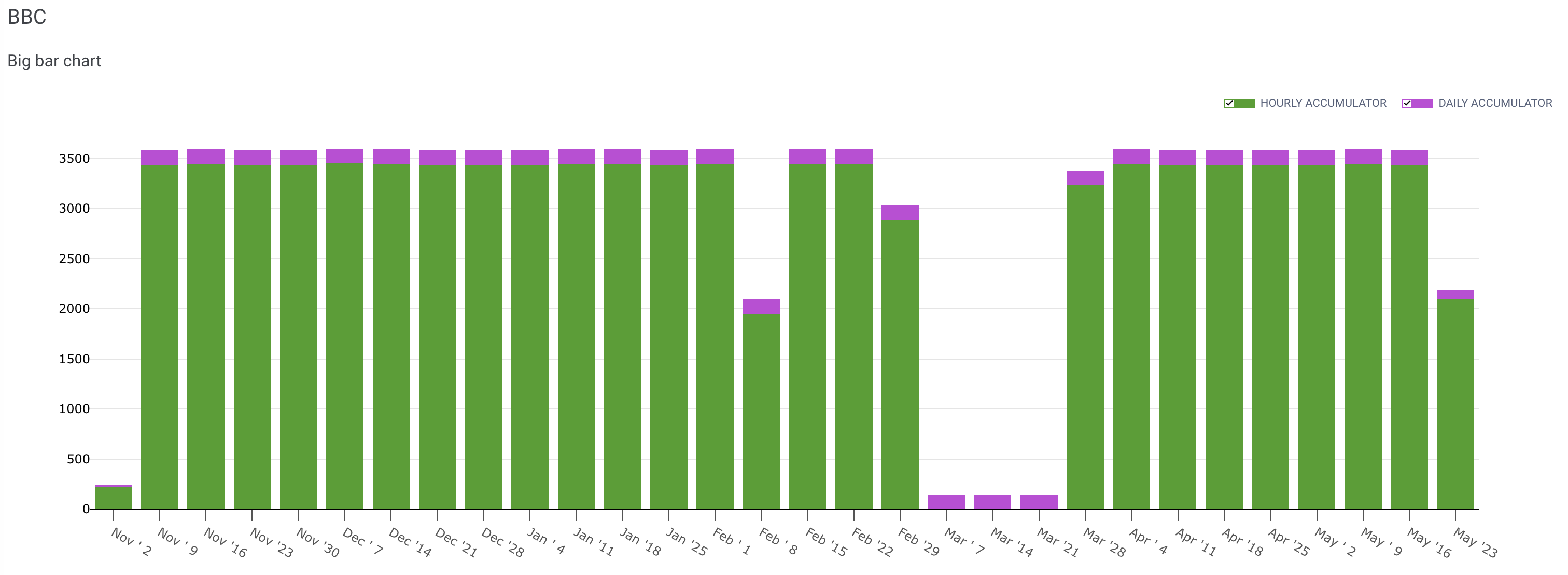
Fig. 2. Bar chart shows accumulation for each week in the timespan.
Scatter chart
Plots the data a series of dots on a 2D plane. Each axis represents a tag, and the coordinates of each dot correspond to the concurrent values of the tags.
Scatter chart helps visualize potential binary correlations, e.g., temperature vs valve opening. Unlike line or bar charts, scatter plotting does not produce a timeline; nevertheless, data sampling is confined to the specified timespan. If data is grouped, dot coordinates match grouped values rather than raw data. Engineering units are predefined and hard-linked to the axes, one for each, in the group’s settings. opens the table of options for these engineering units:
-
Set the limits for each respective axis. Values outside these limits are not plotted. No limits by default/unless specified. -
Sets the scale division for each respective axis. By default/unless specified, step is auto-calculated to fit the observed number of points within the scale range.
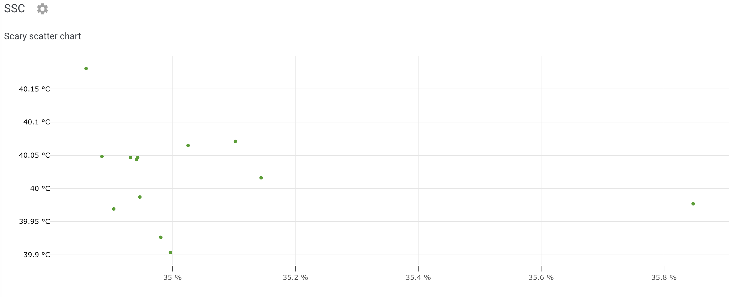
Fig. 3. Scatter chart shows potential correlation between two values.
Tip
Hover over any graph to reveal a tooltip with additional details: tag names and exact values, timestamps (line/scatter charts), and source project (scatter charts only).